Website Mockup
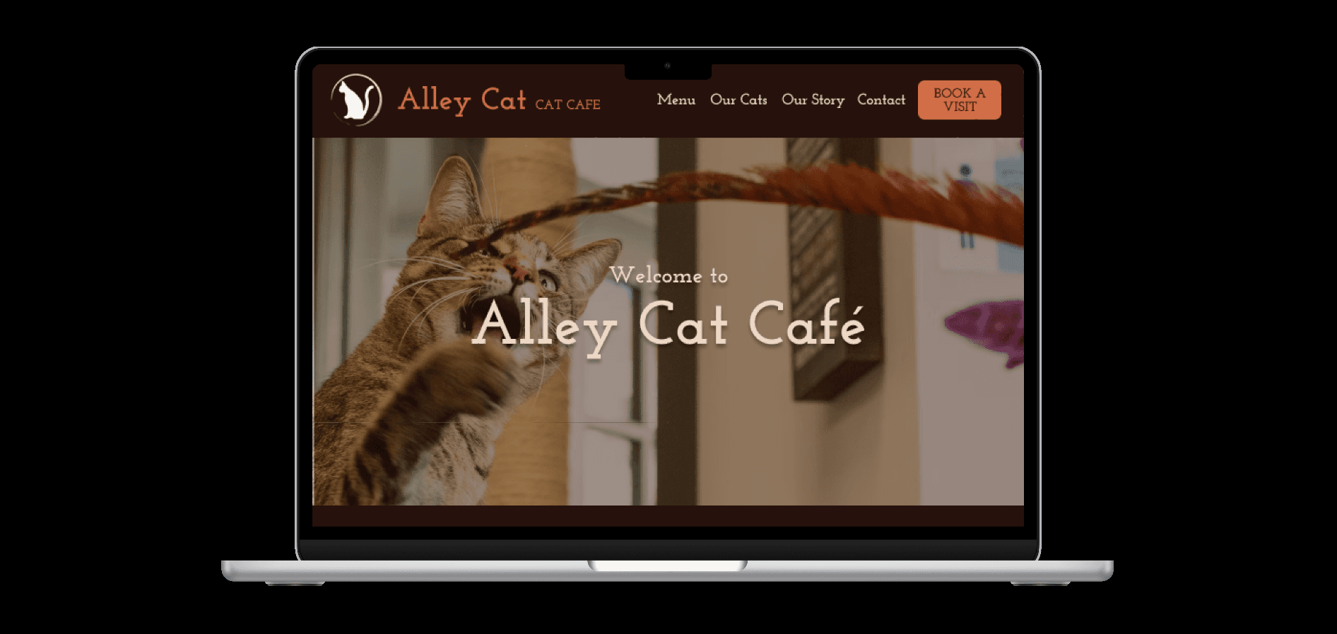
Role
Tools
UI Designer | UX Designer
Figma
Oct 2025
Date
Overview
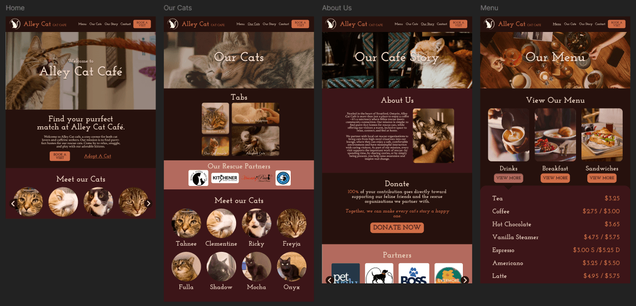
A figma redesign mockup of the website AlleyCatCafe.ca to cut usability errors, improve content clarity, and user navigation. As a result, developed a polished final mockup that communicates its product to its consumer, and emphasizes a call to action all in easy to navigate pages that highlight its own identity.


Context & Problem
Challenge Designer Eye
The redesigned website mockup was a course assignment given to challenge and develop how you as a designer identifies user experience errors and web-flow instabilities, in order to create a new web design that becomes engaging to the consumer.
As a designer, it is crucial to train the analytical eye, as with any other muscle, in order to critically examine improvements in web design. Clarity and visual appeal is a very crucial element I honed in on when designing these pages, which I mainly achieved through effective page blocking and hierarchy, as well as creating a new colour palette that matches with the aesthetic and mood the business was going for.

Original Website - AlleyCatCafe.ca
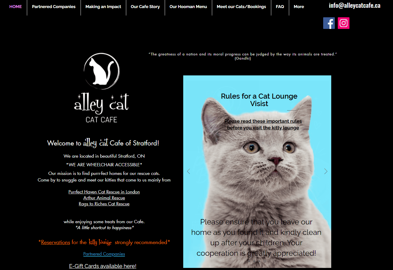
Main Page

Menu Page

FAQ Page
As seen in images above, the pages were overall formatted confusingly, the legibility of certain text was awkward, many images used felt out of place, and personally worst of all, the colour palette is very bland. As a viewer, I didn't feel any sense of warmth or welcome from the website. And as a designer, it visually lacked cohesion, clarity, and hierarchy, something that is crucial to translate to the user if you wish to have more customer business.
Research & Insight
Understanding Client Needs
My first steps in creating a high-fidelity redesign was to understand what the client would want to communicate to its consumer. To do this, I looked into various cat cafe websites to draw inspiration for both artistic direction, as well as effective content flow, such as yumiaocatcafe.com, catcafestudio.com, and purrfectcafe.ca.
I also researched into Alley Cat Cafe’s website to understand what info is crucial to the website’s message, and what info hinders it. To do this, I created a site map to redesign the flow of the website, and optimize site content and navigation for the user. With my redesigned sitemap, 2 whole pages were removed, while maintaining all important information.

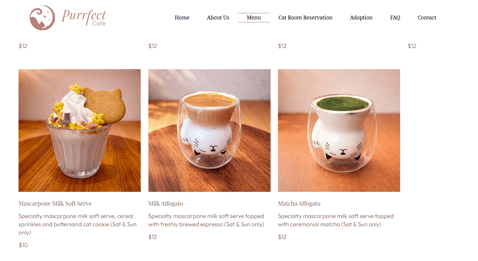


Before (Left) & After (Right) user site-maps


Ideation & Execution
Emotion of Colours
One of the main issues I tackled was redesigning the colour palette to better suit the mood the business wants to create. Using my references, I immediately thought of warm browns and beiges (Top), as they express warmth and hospitality, while also being closely associated with a cafe.
However, this didn’t fit the nature of the title Alley Cat Cafe. I therefore made revisions, using dark warm browns and oranges (bottom) to emphasise the feeling of being in a co zy "alleyway" corner cafe as opposed to my initial palette of a warm autumn cafe (with lighter tones as shown with the sitemap).